

BRITISHER COLLECTION - Trademark Details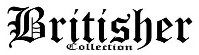
Status: 602 - Abandoned-Failure To Respond Or Late Response
Serial Number
86751091
Word Mark
BRITISHER COLLECTION
Status
602 - Abandoned-Failure To Respond Or Late Response
Status Date
2016-08-02
Filing Date
2015-09-09
Mark Drawing
5000 - Illustration: Drawing with word(s)/letter(s)/number(s) in Stylized form
Typeset
Attorney Name
Law Office Assigned Location Code
L80
Employee Name
WANG, WEN HSING
Statements
Indication of Colors claimed
Color is not claimed as a feature of the mark.
Disclaimer with Predetermined Text
"COLLECTION"
Description of Mark
The mark consists of The words "Britisher Collection" are written in a distinctive and stylized font within the Gothic style of typography, featuring variations in the width of the letters consistent with writing produced by a quill or bamboo pen. The word "Collection" is centered under the word "Britisher." The font of the word "Britisher" is about four times the height of the word "Collection." As to the capital "B", what would be a single straight vertical line forming the left side of the letter of a simple font "B" is in this mark two curved but overall vertical lines. The left line has a large serif so that it resembles a 7 with the tip curved down. Additionally, two downturned smaller serifs come off the vertical line at about 50% down and 75% down from the top. The right line of the two vertical lines has a slight "S" curve to the right at the top and to the left at the bottom. The top right rounded portion of the "B" is a crescent thick at its top and thin at its bottom. This line joins to the vertical line of the interior decoration described below and does not touch the vertical line. The bottom hump of the "B" consists of three exterior lines plus an interior decoration as follows: (1) a short line slightly raised from horizontal, narrow on the left and widening on the right, then turning down to form a thick vertical line; (2) a narrow, slightly incurved line to the left, sloping slightly down; and (3) a thicker, approximately horizontal incurved line culminating in a recurving serif on the bottom left where the two vertical lines of the "B" meet. The interior decoration in the bottom hump of the "B" consists of three narrow lines as follows: a vertical line with its bottom on the thick line of the bottom of the "B" designated "3" above and its top entering into the top hump of the "B", and a short horizontal line slightly curved down and beneath it a short horizontal line slightly curved up to the same degree of curvature. Both these slightly curved lines run from the vertical line of the interior decoration to the vertical part of the bottom hump of the "B". The rest of the word "Britisher" is in lower case. The "r"s have a short, straight, thin serif at a 45% angle at the top. The right part of the "r" is a narrow straight line going up at a 45% angle, culminating in a thick, square line going down at a 45% angle, giving the appearance of a flag hung from a window. The vertical part of the "r" is thick and even. The bottom of the "r" is drawn out to the right with a thick straight line going down at an angle and a thin, short line going back up at the same angle until it reaches the height of the vertical portion of the "r". The bottom line of the "r" also has a small, pointed protrusion to the left. The body of the "i"s is of the same thickness and height as the body of the "r"s. The top of the body of the "i" has an arrow or roof-like point. The bottom of the "i" culminates in a slightly rounded point with a short, narrow serif on the right. The dot of the "i" is wedge-shaped as follows: The bottom is a narrow horizontal line rather completely coming to a point. The left side of the wedge slopes slightly from lower left to upper right, while the right side of the wedge has a more pronounced slope so that the top of the wedge is thicker than the bottom. The top of the wedge is horizontal. The body of the "t" is of the same even thickness as that of the "r" and the "i". The bottom serif is similar to that of the "r". The horizontal crossbar of the "t" is medium in thickness. The area between the top of the "t" and the left end of the crossbar is filled in to form a right triangle. The "s" is drawn in seven strokes, from upper right to lower left as follows: (1) A slightly curved line slightly sloping down from left to right, ending in a rounded serif curving up and back to the left; (2) a thick vertical line; (3) a thick line sloping at about a 45% angle from upper left to lower right; (4) a thin line sloping up at about a 45% angle, culminating at a height equal to the bottom of line 2; (5) a thick line sloping at about a 45% angle from upper left to lower right; (6) a thick vertical line; and (7) a horizontal line with an upward curve. The right upper corner of this line touches the left bottom corner of line 6. The left end of this line ends in a very small serif pointing toward the upper right. The main vertical line of the "h" has at bottom a pointing-down arrow or upside-down roof-like point. The top of the main vertical line ends in two small lines curving out to the left and right respectively like flower petals. From the right middle of the main vertical line a narrow line comes out sloping up from left to right at a 45% angle; after a brief curve it becomes a thick vertical line, culminating in a curved line that narrows and sweeps back so that the curved line ends underneath the point of the arrow. The "e" is drawn in an angular manner. Following the order of hand-drawing an e, the lines are as follows: (1) a thin line from slightly below the middle of the body of the e rising at a 45% angle to the right; (2) a thick line rising at a 45% angle from lower right to upper left; (3) a thick vertical line whose upper right point touches the lower left point of 2; (4) two bottom lines with a small pointed serif at the left, similar to those at the bottom of the "r" but each slightly longer. The hollow part of the "e" is a triangle with all three sides and angles different. As to the word "Collection," the capital "C" is drawn with a vertical loop hanging into the circular interior and touching the edge of the "C" where it slopes to the right. There is also an interior decoration of a narrow vertical line connecting the top and bottom at the highest and lowest parts of the "C". The top line of the "C" curves up slightly at the end. The "o"s are hexagons with thick vertical lines and medium-width angled lines. The "l"s have tops similar to that of the "h" and bottoms similar to that of the "t". There is a short curve to the left at the top of the left vertical line of the "n". The bottom has small serifs on both sides like the base of a column. The top of the "n" is a narrow line slightly sloped up from left to right. The right vertical line of the "n" is a thick line curving to a point on the left on top to meet the narrow line and curving to a point on the right on the bottom.
Goods and Services
Footwear
Classification Information
International Class
025 - Clothing, footwear, headgear. - Clothing, footwear, headgear.
US Class Codes
022, 039
Class Status Code
6 - Active
Class Status Date
2015-09-14
Primary Code
025
First Use Anywhere Date
2014-02-04
First Use In Commerce Date
2014-07-14
Correspondences
Name
Zachary Kummings
Address
Please log in with your Justia account to see this address.
Trademark Events
| Event Date | Event Description |
| 2015-09-12 | NEW APPLICATION ENTERED IN TRAM |
| 2015-09-14 | NEW APPLICATION OFFICE SUPPLIED DATA ENTERED IN TRAM |
| 2015-12-21 | ASSIGNED TO EXAMINER |
| 2015-12-28 | NON-FINAL ACTION WRITTEN |
| 2015-12-28 | NON-FINAL ACTION E-MAILED |
| 2015-12-28 | NOTIFICATION OF NON-FINAL ACTION E-MAILED |
| 2016-04-15 | TEAS WITHDRAWAL OF ATTORNEY RECEIVED |
| 2016-04-15 | WITHDRAWAL OF ATTORNEY GRANTED |
| 2016-06-15 | TEAS REVOKE/APPOINT ATTORNEY RECEIVED |
| 2016-06-15 | ATTORNEY REVOKED AND/OR APPOINTED |
| 2016-08-02 | ABANDONMENT - FAILURE TO RESPOND OR LATE RESPONSE |
| 2016-08-02 | ABANDONMENT NOTICE MAILED - FAILURE TO RESPOND |


